About

This blog is for video and graphic design.

Thursday, May 14, 2015

Video Final: Short Film


Process

          Our final for video was to create either a short film or a news package. I chose to do a short film. There were a few boundaries for the short film. The film had to be between three and five minutes. The film had to include a water bottle, a visible and obvious source of light, a hat and the phrase "lights out" had to be spoken. 

          First, we were put into groups. Next, we began brainstorming ideas for the film. My group decided to do more of a serious film. Then, we began writing the script and storyboarding. I helped with the storyboards and I also assisted with the script.

          Next, we began filming. While my group was filming, I was an extra in another group's film. I filmed about half the time with my group. The other half, I was acting in the other group's film. With my group, I helped with voice-overs and filming. With the other group, I just acted in a few scenes.

          Then, we began editing. The clips were on different SD cards, so it took a while to import them. After they were imported, I began editing. Because filming took so long, I had to come in before school one day to edit. I managed to finish editing with more than enough time to upload it to my blog. 

          Finally, we presented the video. We watched the video in class and got feedback. There was a lot of helpful constructive criticism. 

Challenges

          My biggest challenge was that I was in another group's video, so it was difficult to find where all the clips I needed were. My group was very helpful and they helped me find the necessary clips.

          Another challenge that my group faced was incorporating all of the necessary elements in the film. It was difficult to include all of the requirements without making it look like they were just thrown in. We had to find creative ways to incorporate them without taking away from the story.

          Another challenge was that we had to film a lot outside of school. It was difficult to arrange it where we could all go film. I was also absent a few times, so it my group had to work without me for a few days.

In the Future

          I would make the ending of the video more clear. I think it can be confusing if it isn't explained. I would also film some of the shots again because they were too windy or too long. I would film more angles of the same shots in order to gain more variety. I would cut out a view of the shots because they were extremely long or unnecessary.

          I would keep the same actors. I think they both did a very nice job. I would also work with the same group again. We all worked very well together and were very productive. Overall, we were a very focused group.

What I Learned

          I learned a lot about how difficult it is to incorporate random elements. I also learned that it is  difficult to create a short film in a short period of time. I learned a lot about working together. Our team collaborated really well. I gained a lot of valuable knowledge from this experience that I will be able to apply in the future. 


Conclusion

          I am happy with how my video turned out. My group worked very well together. I liked the script and I liked how most of the shots turned out. I learned a lot from this project and I gain a lot of knowledge that I will be able to apply in the future. Overall, this project was a good experience. This class taught me a lot about creating videos.

Friday, May 8, 2015

Creative Carton Design

Project

Our project was to get a toy and create a package for it. The package had to also have a second purpose. Our toy was a penguin stuffed animal. We decided for our second purpose that it would unfold to become a 'snowy landscape' for your penguin.


Process

We started the project by deciding what our toy would be. Then we chose the second purpose. We created a type and color palette. Then, we divided up the work. We used a mandala that we had already created. Then we began creating the inside and the outside. After, we created a 3D revolve and finalized the project.

Challenges

My biggest challenge was that we had to work in teams of 2 or 3. For me, I like to work quietly and quickly, so it was difficult to collaborate with others. I also had trouble thinking of what to do for the inside. One of my biggest problems was the 3D revolve because it takes me awhile to create one. One of my teammates was incredibly skilled at creating them, so they were able to take over and do it.

What I Learned

I learned a lot about collaboration. I hadn't collaborated with others in graphic design before, so it was a new experience. I also learned about creating that inside of packages. I learned a lot about how to improve 3D revolves. Overall, this project was the one that taught me the most.

Thursday, April 23, 2015

Carton


Process

I started the project by thinking of an idea. I decided to make a product that allows you to have a pet penguin. Once I had my product idea, I created the template and added the bleed. I started by choosing my type palette and colors. Then, I created a logo and added artwork and copy. Finally, I added color chips and a barcode.

For my label, I continued the same colors and fonts. I created a mandala that was good for my palette and changed the opacity until it was to my satisfaction. Once it was good, I placed it on the label.

For the 3D revolve, I spent a lot of time creating the bottle I wanted. Then, I created the boxes and revolved them until I was happy with it's appearance.

What I Learned

I learned how to use symbols and create a 3D revolve. I learned about bleed lines and how much work goes into carton design. I learned about color chips. I learned about the process of creating a product.

Favorite Part

My favorite part was incorporating the mandalas into my product. I enjoyed tying two separate things together. 

I also liked creating a product and a logo. It was fun thinking of ideas and it was fun to create a logo for my own product.

I also enjoyed creating a color and type palette. My inspiration for the colors was the colors of the penguins. I didn't want my product to just be black and white, so I chose pink because African Penguins have pink around their eye.

Problem Solving

My biggest problem was deciding what would go on each panel. I tried out different ideas until I was happy with how it looked. 

I also had trouble creating a bottle for the 3D revolve. It wasn't looking like I wanted to at first, but once I manipulated it, I was very happy with how it turned out.

Although I enjoyed it, I also had difficulty choosing a color palette. I wanted my product to be more than just black and white, so I chose pink based on the African Penguin's most unique feature.


Thursday, April 16, 2015

Mandalas


It's important to have brain  breaks so that you can focus better. It helps you stay focused and be more productive if you give yourself a break. Mandalas are a great thing to do for a brain break because they are fun and easy and quick. 

Personally, I enjoyed playing with different shapes and messing with the opacity. I even put one of the mandalas on my label for my product.

eMagine

I went to eMagine and I really enjoyed it. There were four main categories with a lot of sub categories. I really enjoyed seeing what everyone created. It was very interesting to see what people are able to design and create.

Thursday, March 12, 2015

Better Blog

CARP

CARP stands for contrast, alignment, repetition, proximity. 

C: Contrast can be between fonts, colors or other aspects of blogs. 

A: Alignment involves how things are aligned. Grids play a huge role in the alignment of blogs. Posts should also be aligned left and ragged right. 

R: Repetition is also involved in the layout of blogs. Repetition can be used with images, fonts, colors or other aspects of graphic design.

P: Proximity is the spacing between things. It's important to have white space. Having good proximity makes a blog easier to read.


Layout

I made some minor changes to the layout. I checked to make sure everything was readable and looked professional.


Functionality

The main functionality adjustment I made was adding label and portfolio pages. The labels make it easier to find posts. The portfolio pages also aid in finding posts.


Improvements

On some of my old posts, I added headings. I broke the text up into smaller groups to make it smaller and more readable.

I also added a favicon, portfolio ages, labels, and other gadgets. I customized my template and messed with the header. I really like how it looks now.

Before and After

One of the pages I changed greatly, was my first post. I added headings and broke the text up. I made the entire post more readable and better overall. The top one is my original and the bottom is the improved post. I think the improved post is easier to read and more organized.

I applied the rules of CARP.

Before
After

Friday, March 6, 2015

Text Container Tutorial

This tutorial was also very easy to follow. The directions were simple and explained well. I learned a lot about outlines.

Tutorial: http://www.photoshopessentials.com/photoshop-text/text-effects/text-inside-text/

Sugar Bag Tutorial


I did the sugar bag tutorial. It was very easy and quick. The steps were very descriptive and easy to follow. I added my personal touch by changing all of the colors but the accent to blue. I learned a lot of keyboard shortcuts. This tutorial was very helpful and I'll be able to apply a lot of the knowledge in the future.

Thursday, March 5, 2015

Movie Poster

Process

I started this project by brainstorming movies and sketching different options. Once I decided on Frozen, I thought back to a previous tutorial that I have done. It was a firefly brush tutorial but I knew I could manipulate it to make it appear as snow. I applied the brush to text and used what I learned from the "working with type" tutorial to add icicles. I added the snowflake inside the "o" and moved onto the next step.

I laid out a grid. Creating the snow and icicles at the top was very difficult. I used the snow brush but manipulated it more to make it thicker. Then, I created and added the icicles. Once I did that, I added the random snowflakes in the background, still using the snow brush.


Finally, I added the snowflake. I used the snow brush again and manipulated it until it looked how I wanted it to. I had a few different options, including a swirl but ultimately, I decided on a simple snowflake.


What I Learned

I learned how to manipulate brushes. I also learned how to create straight lines with brushes. I learned a lot about Saul Bass. I learned a lot about movie posters. I learned a lot from the "working with type" tutorial. I learned a lot about manipulating text.

Favorite Part

My favorite part of this project was creating the individual elements to create a cohesive poster. I liked that I created everything by myself. I loved manipulating the brush.


Boundaries

It wasn't difficult for me to meet the creative boundaries. It was easy to choose a movie from the past five years. It was easy to have it inspired by Saul Bass. I used three different shades of blue, repeated. All of the elements on my poster reflect the story. I was able to create a custom graphic as well.

Monday, February 23, 2015

Working with Type

For this tutorial, we had to learn to manipulate text. We had to mess with the kerning and the tracking. We learned how to create outlines and to add anchor points. Then, we used our own names to have the same effect. I curved the "y" and the "s". I extended the "h" and cut off part of the "o". I learned a lot about the manipulation of text.

Monday, February 9, 2015

My Top Ten Favorites

My Top Ten Favorites


Values, Consumption, and Identity

This project was to create a poster showing our top ten things we cannot live without to determine our values. Values drive consumption. If the values match the buyer, they will be more likely to purchase your product. Identity helps us understand the different roles we play.


Typography

I learned how to pair typefaces. I enjoyed pairing typefaces. It was interesting to see how typefaces looked together. It was hard to choose which fonts to use, but ultimately I decided on Pistilli and Arial.

What I Learned

I learned a lot about how values affect decisions buyers make. I learned how to use InDesign to create grids. I learned how to create type palettes and apply them. I learned a lot of new terminology. I gained many valuable skills that will be helpful in the future.

What I Liked/Disliked

It was very difficult making a list of ten things. There were so many products I had to choose between. It was also a challenge to use InDesign for the first time. I liked that I was able to be more creative and have it be personal. The poster is unique to each person. I liked gathering the images. I thought it was fun to choose what would look good together. I also enjoyed pairing typefaces. Overall, I really enjoyed this project.

Friday, January 30, 2015

Kerning


Kerning is the space between individual letters. Kerning can be changed to improve the look of words. Good kerning can increase legibility. If kerning is poor, it can be difficult to read or unpleasant to view. 

Very Strange Friends: Very Strange Party

Thursday, December 18, 2014

Exciting Career at SeaWorld

Reflection
I really enjoyed the first semester of video. My favorite project was our final and the music video and the Lego project. My least favorite project was the six shot sequence videos.

I enjoyed the music video because we were allowed to be as creative as we wanted. We had more freedom and could choose major components, including the song and the story. I enjoyed that it was more vague and that we also got the opportunity to shorten and fix it.


I liked the final because there was a lot of different stories that could be told with the clips provided. I thought it was challenging to not know the story until I actually started editing, but I thought it was fun. I was able to choose whatever I wanted and create any story. I also liked that there was a strict time requirement, so I knew that my video wouldn't be too long or too short.


I also enjoyed the Lego project because I was able to choose the story I wanted to tell. The people I filmed made it easy to find a story to tell. I also liked that it was different than the other projects we had done.


I did not like the six shot sequence videos because they were tedious to film and edit. There was not a lot of options to express creativity. I also disliked them because I found them more difficult to edit to create an interesting story.


Overall, I have enjoyed my first semester in video and I look forward to the second semester.

Wednesday, December 10, 2014

Working Together With Legos Creates Challenges and Donating Blood Saves Lives

Process

For both projects, there was a not lot of preproduction and it differed from previous projects. For this project, there was no storyboarding. There was not any idea of what the true story would be. It was a project that could be interpreted many ways. 

In production, there were a lot of challenges. It was very difficult not using a tripod. It was hard trying to keep the camera steady. It was also very hard thinking of questions to ask on the spot. In the lego project, it was easier because the "actors" knew that you were going to be asking questions and moving around. For the blood drive, the people did not know exactly what you were going to do, so it was more difficult. Although there was difficulty, I able to get all of the needed shots.

In postproduction, I found it difficult to juggle both projects. It was hard remembering which project needed certain edits. I had trouble creating J and L edits, but in the end, I created them. I had to create a script and add voiceovers. I thought this was the hardest project to edit.

Things I Learned

I learned how to add voice overs to my video. I also learned how to create J and L edits to make the transitions smoother and less choppy. I learned how to do backpack journalism.

Reflection and the Future

In the future, I will be able to use voiceovers and J and L edits to enhance my video. I will be more experienced in backpack journalism. I enjoyed this project because I got to be more creative than previous projects and I got to choose the story that would be told.

Tuesday, December 9, 2014

Glossy Gold


Process

I followed the tutorial to create the glossy text. I was unable to download the background that it wanted, so I created my own. I applied all of the effects to the "Zoey" and I applied some of them to the "Zoey Chasen". One of the effects that I needed was not available, so I chose one similar to the original. Although it is not identical to the tutorial, I am very happy with how it turned out.

In The Future

In the future, I will be able to apply my knowledge of effects to future projects. I learned a lot about different effects, including satin. I learned a lot about overlays. I enjoyed this tutorial because I had to problem solve a lot and in the future I will have the necessary problem solving skills to finish more difficult tutorials.

Reflection

I am very happy with the outcome of this tutorial. It was very simple and well explained. I love how the glossy gold looks.

Monday, December 8, 2014

Postcards


Zoey Postcard


I chose to put one of my dogs in the Z because my dogs are very important to me. I love animals and in five years I want to have a dog. For the O I put me and one of my best friends. I thought it was important to include my friends because they are a huge part of my brand. For the E I chose n print with Alpha Delta Pi in it, because in five years, I plan to be a member of Alpha Delta Pi. For the Y, I picked a Vineyard Vine whale print because I love Vineyard Vines.

The process was relatively easy. I created each letter, separately. Then, I placed an image for each and created a clipping mask. Then, I adjusted the coloring and the brightness. Then, I added a drop shadow and added the background and my name.

The biggest problem that I encountered was getting each letter to look cohesive. It was difficult making them fit together. I also had difficulty getting each picture to fit well with the letter.

Ocean Postcard

For this postcard, I chose starfish for my repeated object. I chose to put a fish in and a picture of the beach. I did a gradient for the word "ocean" and I used my name as a tagline. I added a border that was the same color as the tagline. For the border of the photo, I made it the same color as one of the starfish.

The process was relatively quick. I extracted each image and placed them on top of the background. I added a border to the photo and to the image. Then, I added the tagline and the word "ocean". I created a gradient for "ocean".

I love how it turned out. I think it looks cohesive and I am happy with the outcome. The biggest struggle I had was figuring out how to do a gradient in the text.

Penguin Tutorial

I chose penguins for my third postcard because I love penguins. I  added three penguins. For the tagline, I put my name and made it the color of the penguin's sweater. For the word "penguins" I did a black and white gradient, to replicate the penguins.

The process was similar to the other postcards. I added the extracted objects to a background. Then, I placed the text and added a gradient to "penguins".

I love how this postcard turned out. I think it's adorable. I love how the penguins are partially off of the postcard. I love that the large one is in comparison to the words.

Reflection

I enjoyed making the postcards. I learned a lot from this project. In the future, I will be able to apply many of the skills I learned to enhance future projects.

Monday, December 1, 2014

Professional Penguin Mountain

The Process

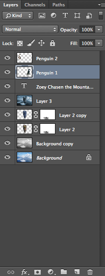
I extracted a mountain from a photo of a mountain with a waterfall and put it into the sky. I had to recreate the tip of the mountain using blend modes. I had to remove pixel fringe. 

I was able to pull a lot of information and skills from previous projects, including defringing the hand. 
Throughout the process, the refine edge tool was very helpful. It made the mountain look smoother. After extracting the mountain, I placed a cloud in front of it. 

Then, I added two objects of my choice. I chose the images from http://www.morguefile.com. I chose to add two penguins because I like penguins. To add the penguins, I used the quick select tool, which made it very easy to add them in. 

Overall, I am really happy with how my mountain turned out and I am very happy with how the penguins look. 


What I Learned

I learned how to easily extract an image and how to combine previous things I learned, such as defringing. I learned how to use overlays and how to jump layers.

The Challenge

I had trouble using the refine edge tool because the penguins blended in with the background, but I eventually got it to work. I also had trouble placing the cloud in front of the cloud. It was difficult to get it extract the cloud perfectly. 

In the Future

Next time, I will add more images. I would use that same tools if I repeated the process. In the future, I will be able to add images without pixel fringe. I will be able to pull information from this project to expand my knowledge. In the future, I will feel even more comfortable with photoshop.


Conclusion

Overall, I am very happy with how it all turned out. I think the mountain looks good and the cloud looks realistic. The mountain's tip turned out how I wanted it to. The penguins add a touch of my personality.